Why?
To find the right color and match it with the site, the brand and make everything looks pretty is not easy at all. Everything count when you want to create the appropiate flow in your website and to convine colors that make sense was super hard for me. There is a whole theory and courses that you need to master before even thinking about this. However, with this assigment, I pretend to be an expert so I played around with some colors, convine them and try to find out which one works well for my site.
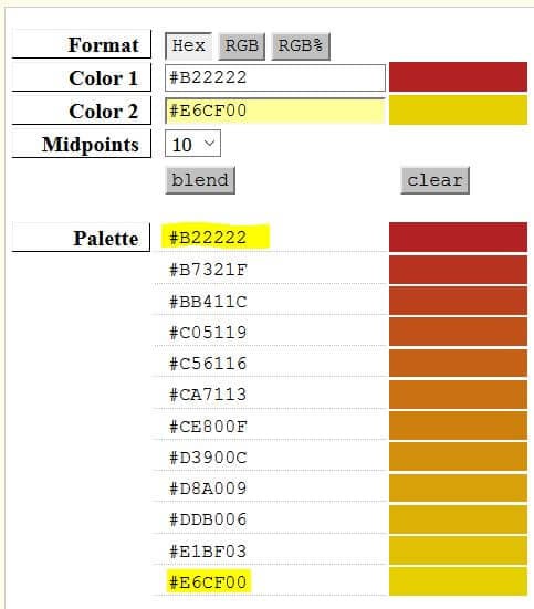
At first, I choose FireBrick or #B22222 (red) and then I decide to use #e6cf00 (yellow) as my second color.
- Background: FireBrick or #B22222
I decide to use this color at the begining of the assigment because I have a project about the DACA program and as you could imagine, when I think in DACA, I think in red! A red of changes and progress!! In my opinion, red help getting the user focus on the web and highlight and match perfect with the yellow text that I am using in this web. - Text in general: #e6cf00
I decide to use yellow for the text since it matches really well with red but I later change my mind and switch everything. I start to play with a couple of colors and come up with new ideas. I keep another type of red (Cherry Tomato: #E94B3C;) and yellow (Meadowlark:#e6cf00;) in the title of this assigment.
Playing with colors...
Ultra Violet
Red Pear
valiant
Ceylon Yellow
Martini Olive
Russet Orange
Crocus Petal
Limelight
Quetzal Green
Sargasso Sea
Tofu
Almond Buff
Meerkat
Greenery
Meadowlark
Cherry Tomato
Little Boy Blue
Chili Oil